Monday, December 12, 2011

Final Portfolio

Over so soon? Ahh, say good bye to 7:30 class with a room full of kids that thought a four color spread meant it had to be 4 spot colors. Its been fun...

Classical {cabbage} cover: Another last minute design that just so happened to work out.


Native American Heritage Month: Wheres our obnoxious head line Maggart? No where to be found-same can be said for shit fonts on my poster. Making baby pink bad ass..just another day in the office.


World Record: Longest marriage. The one that I turned in for class was tallest hair style but I think that this one was a better idea and had a stronger use of color. Rusty shoved the use of line art down my throat, but he provided an excessive amount of tissue paper for the cause, so humored him. Turns out, ol' Rusty was right again-the line art improved the piece a lot.

Life and Death: Don't Hang yourself, surprise yourself. I tried to redo the "death" one but with little success, turns out I can only make illustrations the night before they due, when the Cardinals are playing in the World Series and I could really care less. Food for thought.

Sunday, December 4, 2011

Day-um, Gurl! { Look at Dat Weave!}


Ah, my alter ego! Nice weave sista!
OK, This is my world record illustration for tallest hair style. The record I found was set by Marie Antoinette and her hair style was like 3 feet tall. However, I was pretty sure that Lady Gaga has probably either topped that or at least tied it, so, Gaga was the inspiration that I used for the face and head. I designed this to go across a two page spread, because I figured that this much weave couldn't possibly be contained on a 9 X12 page. Boom-pow, world record: donezo. 

Friday, December 2, 2011

RUSTY RUSTY LOOKY LOOKY

Here is some shit for ya :) Bon appetite 


Done, naturally, the day before it was do. I like all of the separate components, the candelabra and the wash/splatter thing. I made the text by cutting the font out of a gold sheet that I spray painted to give it a kind of luxurious/ baroque-y look. I listened to a lot of this guys music and I actually like it. The one that I put on the album was Scarlatti Sonata C Minor K11-L352. Youtube it, bro.


Wednesday, November 9, 2011

I've Decided

I should be the boss of everything.
I don't know what the hell I want to do with my life, but I know I want to be the boss. I am a reasonable person, therefore I should have the power to tell people no. In FAP, I believe I should have the power to tell dumb ass health kids- NO. But I don't. At my job, when people come in after hours and ask if they can look around while I am cleaning up (making more of a mess for me to clean up, I should be able to say- NO. But Im not the boss so I cant. This should all change. I am a bitch so people would be afraid of me and not be inconsiderate ass holes. 

Monday, November 7, 2011

Society of Illustrators

Well, its safe to say Im not a part of the hoity-toity society of illustrators. but here is some stuff that I made just to waist money :)

Friday, October 28, 2011

Life and Death: The "Due" or Die Moment

"Don't hang yourself"

"Surprise Yourself"

"Don't hang yourself, surprise yourself" is the design advice that Ashley and I found in a really super helpful book Matt made us by for his class. I started this illustration at 7:30 and came to get it printed at 9.  Not bad timing Maggart. I am actually happy with how these turned out. I think that color/ washes are what I do best and I was wanting to do something more gestural and suggestive than the realistic crap I've been trying to do. Cut throat. Got-er-done.

Wednesday, October 26, 2011

Viva la Mixer


Oh lorry am I behind. I did this in class today in hopes that it would turn into something I could use for life and death. It didn't. but here it is anyway

Friday, October 21, 2011

The Magg Five-Five

Ah, hah. The gouache momentum is coming back. This is my mom's 55 Chevrolet pick-up truck and in the top left is a replication of the custom historical license plates it has. 

Not bad Maggart, not bad

Tuesday, October 18, 2011

Midterm Portfolio

Traditional Line Art:


These first two are line art drawing that I made large scale to turn in. The bottom one is a nice, loose, gestural illustration, while the one on top combined structured ruler lines as well as gestural lines.


Line art redo (above). I was freaking out about the quality of my line art drawings, so I wanted to make some fresh ones for mid term. I intended to make more than one, but decided that the two above really weren't so bad. I was thinking, "hmm, what shall I draw?" I was watching Sex and the City 2 while working on my #5 gouache, and seeing as I am obsessed, my subject matter didn't take long to figure out. This is SJP (Sarah Jessica Parker, duh!) with a bling bling #2 that is similar to the movie cover. I was really happy with how it turned out, especially in the dress.
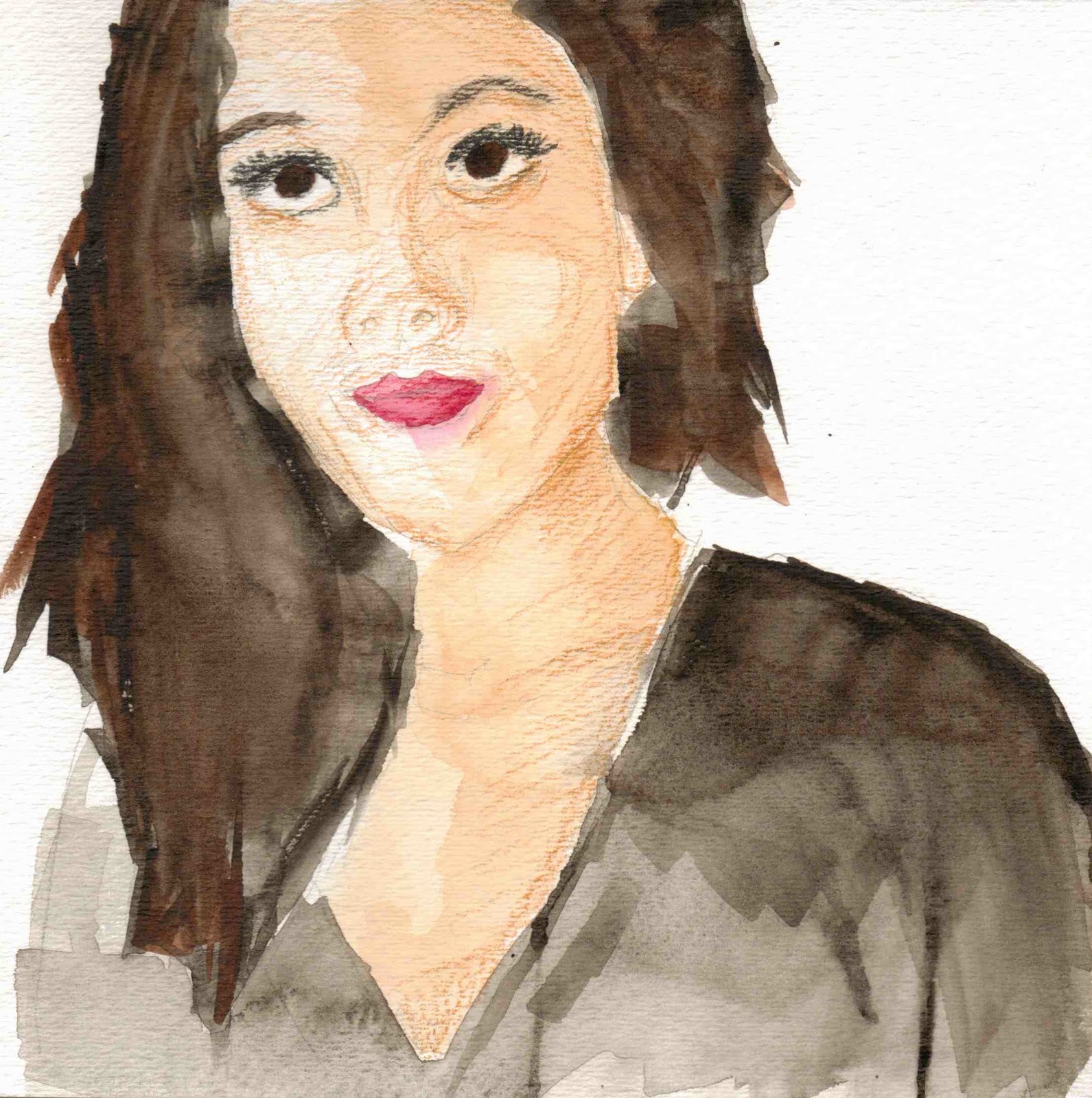


Watercolor:


Well, I felt like I had a little bit of and "ah-ha moment" with both of these; lesson being that it really does make a difference if you let your watercolor dry. I worked on these at the same time and just worked on one while the other dried. One new thing I did with both of these was adding structure and line art in with just watercolor instead of pin and ink (again, learning that it is very important for the project to be dry before that is possible.) Another thing that helped these go a little more smoothly was the scale...should have enjoyed the 8" X 10" projects while we had em!


Watercolor + Line Art:


This is from the architecture watercolors "10 a days". I had really been struggling with the watercolor but  doing simple line work to give structure before I laid in color really helped me out. I think that the colors and composition of this particular barn scene made it pretty successful.

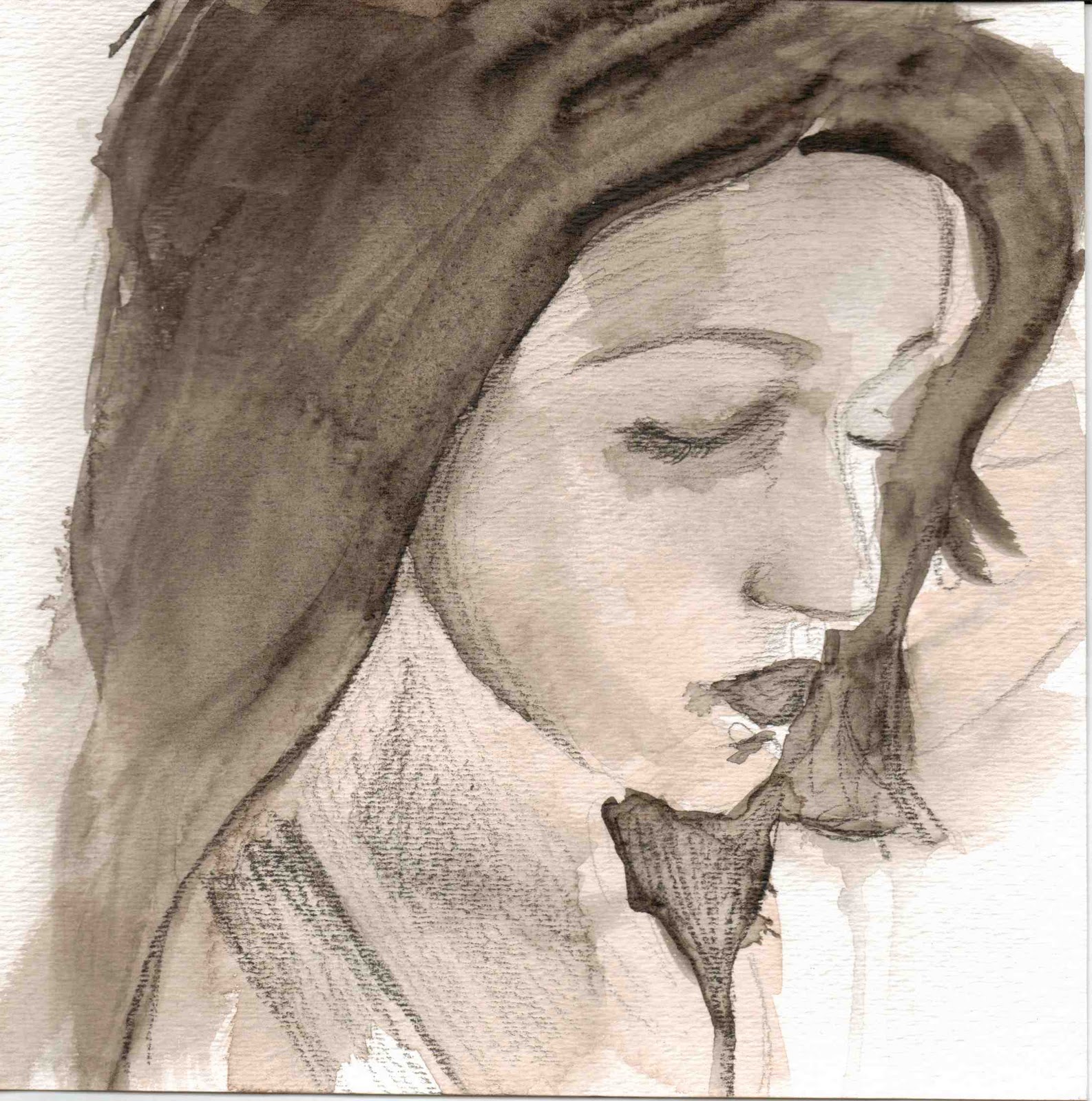
Shhheeee's Baaaaaccck! Couldn't help sliding a fail proof self portrait in the mix. This was one of the first watercolors where we started to increase scale which really overwhelmed me at the time, but after scanning it in, it tightened up and came together pretty well. (I think it would be cool to re-work my beer bottles with this little gal one it!) Future project? Maybe!

No bout-a-doubt, Im from the Midwest, and since Rusty seems to revel in that kind of crap, had to throw my little rooster in. I did three versions of the rooster, they were actually part of the three in-class watercolors that we were supposed to be doing, but, go figure, I was having a rough morning and didn't do my three watercolors in class. I did, however, take it upon myself to make up for my lack of effort in class in my own time and that resulted some interesting watercolor experiments. The line work is really minimal in the one, but I  know the sharpie could have gotten out of hand quickly, so I decided to go with "less is more" on the line art. Overall, I think the colors and strokes in this piece are pretty nice for a rookie!


Gouache:

AHH-HA! This was my moment for sure! This was the first time I had ever worked with gouache (despite Rusty's suggestion to practice first). I had a lot of fun with the bright colors and really "kicking' it in the ass" on my saturation, something I found a little lacking in my watercolors. I think that the picking method used with gouache is really my friend, and relative color is the enemy! Do a wash and then pick it sister, thats my new motto
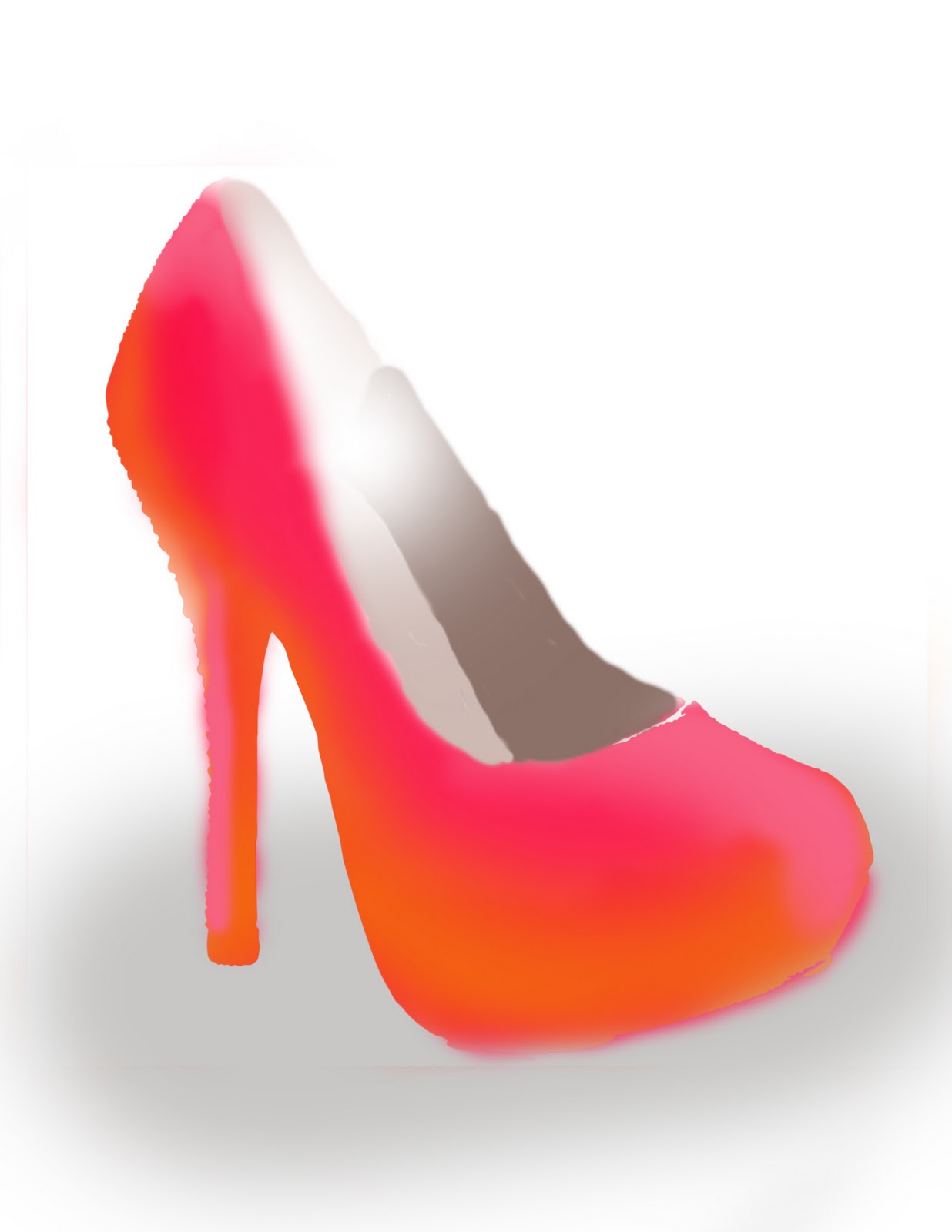


Wack-em:

Oie Vay! I thought that I couldn't draw with pin and paper, this wacom tablet presented its own, worse difficulties. It as hard for me to refrain from using shades of grey on the line art, so I did several of my first ones incorrectly, but I found that keeping it "losey goosey" and not trying to make things so realistic was that best way to go with digital line art.

Here, on the paining, I was able to use the different shades, which help me create an overall image more like what I was going for. Buuut, most of all I think I shall avoid my tablet for the time being. 


My Choice:


"Your Choice" pahaha who does Rust think he is kidding? Well, Rusty, if it was my choice for an illustration, I would pay a real illustrator to do something that looked wicked good and be sleeping like a baby at 7:30 every Monday, Wednesday, Friday. But seeing as that was an option, I decided to post something wicked good that I made instead hehe. I felt like this was a good candadit for the open project on the midterm because I wanted to use one of the "Facebook" pictures we made somewhere in my portfolio. Also, I really like the pencil line art in this one, but it is really subtle, so I was having a hard time deciding if it should go in the watercolor or the watercolor + line art category. Problem solved. 


Thank God, we're half way done with Illustration 

Monday, October 17, 2011

Comp till you puke!

Funny story, Im an idiot. This is Demeter who is the goddess of harvest next to what was supposed to be Hades. Thats where it comes into play that I am an idiot, this is not really Hades, but I didn't stop to think about that before I drew it at 2 in the morning. oops. Oh well, this is the one Rusty wants me to re comp and use for life and death. 

Taylor Swift killed country! This comp isn't finished but it was just supposed to show Loretta Lynn, an actual country singer from back in the day juxtaposed with Taylor Swift who is killing the name of country music as we speak. But because these weren't finished, you couldnt really tell what that point was. My b

Tee Hee Hee. If you don't get the life and death in this one, its time to have a talk with your parents

Stinkin' Lincoln

Well scale is the enemy here my friends. This looked absolutely nothing like my comp and ended up getting way over worked. I tried to tone down the colors on the print out to make it less intense... lets just say it was not my best judgement call. And as much as I hate to, I gotta give Rusty mad props for the nice eye balls, that was all him.


Monday, October 3, 2011

Gee-wash-ee

An "ah-hah" moment perhaps? Dear God, lets hope. In this post I present to you, my first project in Illustration that doesn't suck too bad. Enjoy it while it lasts...

Oh oh, or just re-vistit it on the blog when  start making bad illustrations again 


Balloon animan, soy sauce, and a tank. I looked like a real art kid packing this bad boy around... just another day in OP

Friday, September 30, 2011

What's that I see? Positivity?

FIRST "OK" OF THE SEMESTER!!! Enough to bring a smile to even my face! (Of course, he told me I have to change a bunch of stuff, but hey, I'll take what I can get)


Bon weekend!

Wednesday, September 28, 2011

Never Again!

Never, EVER again will I draw hands. Uhg! I know better than to choose a subject matter that I care about , but I did it anyway because I suck. Well here ya go.

Producing a Product


Creature of habit, I'm in love with my mixer.  I knew that this is what I was going to make for my product illustration, but I decided to make a few more while I was waiting for this one to dry.


I think that I actually liked this illustration a little more, but Rusty, being the dream crusher that he is, wouldn't let me use it because of the colored background.


Crotch spray. I told Rusty I was going to make one just to make him uncomfortable because he would help give me any ideas. Do my dismay, he said all he said was that he lived in a house with all women. Shit.

Sunday, September 25, 2011

Let there be COLOR!

Well, not that these are anything to be too proud of, but I didn't really mind doing them. I felt like using the color and getting rid of the line art make it kind of like watercoloring on the computer (less messy AND less expensive than doing the real thing._


Black and white wacom wonders

Open subject matter can really tell you a lot about a person... haaa shoes, sheep "sauce"


Hey! Everybody come see how good I look!

Well I may not be able to water color, but thank the lord, I am ridiculously good looking

I think this was my fav, I like the wash and I don't know if its allowed, but I like the look of the pencil line art a lot more than the sharpie, its more subtle and more forgiving fa sho. Really like the bottom of the shirt. Mmm, nice

Something wonkey going on with those eye balls. kinda like the strokes in the sweater and hair though

Vis Vomm II rises again! bwahahah! this is by far the most accurate depiction of what I look like on a daily basis. I was gonna go in and add line art but Im glad I didn't. (side note, noo freaking clue why the eye brows are brown, I was using the same orange as everything else, oops)


Daymn gurrrl look at deem lips. haha I may have over done those a little. but hey, the shirt's not all that bad.