
Wednesday, March 30, 2011
Oh Kay!
Yesterday, after making several, annoying, presistant, visits to Rusty's office, he approved my "Lets Eat" layout. I didn't start it over and I finished it under budget. Who is this new Shelby girl? I think I like her...

Tuesday, March 29, 2011
Raman: The Food for Commoners
Well, I myself do not like to partake in any kind of Raman noodles. But, for the sake of design, I did make three versions of the low budget meal to get photographs for my "Lets Eat" spread. I took around 200 photos but I'll only post a few. Also included, yummy yummy chex mix that was also for this spread. I am not including the spread because I am hoping to blog it in joyful post once its been approved .


Breakfast: Maple Brown Sugar Raman


Lunch: Beer Noodles

Dinner: Stir Fry Raman


Anytime: Granola MMmm
{ Hot Stuff! } hehe
Wick Fowler's 2 Alarm Chili
Well this is just the tip of the ice burg of all the stuff to do for this project but it has been approved and that is a pretty good start if you ask me. I am pretty happy with this. The objective was to make it stand out on selves and to make it seem spicy but not so much so that it would scare off skeptical buyers. I think that the label has clean colors and illustration style that will do both of those things. I like how simple the label looks even though it was anything but simple to make. I had to remake the pattern a hundred times because Rusty said my beans had nodes. Also, after printing a draft, I realized that my measurements were off and I had to resize the whole can! Also, remaking their ugly logo and the nutrition facts really tested my patients and retina strength. Now I still need to make 3 ads and 3 huge posters. Fingers Crossed!

Bon Voyage Freaks!
Well, in true Shelby fashion, I restarted this about a jilion times! Alas, the 32 page booklet has been approved. 32 pages Shelby? Really? Why, ya coulda done 20? Well, although it was expensive and a pain in the butt, I am glad that I chose to spread this out over more pages and rework all of the images. My document started off as being really image heavy (I am now addicted to National Geographic Travel Photos). But after working with it and reading the text, I realized, "Hey, this is really more about getting organized and helping students get prepared to study abroad. So, I tried to put myself in their shoes and ask myself, "what would I find helpful if it were me?" I decided that beautiful images of places that Truman may not even offer in Study Abroad probably want the best solution. So, I decided to just make the text organized and easy to follow with out being stale. Im quite pleased with how it turned out. (Even though printing a color proof cost me and arm and a leg and much anxiety)


Ugh, finally!

I can't even begin to count how many jazz posters I've made. I know that there were about 10 versions of this one alone! After being drug out over half of the semester, Rusty finally put one of he infamous "ok's" in the corner. Its a day late, but hopefully not a dollar short, actually hopefully it was worth it and it would be like a dollar gain? Anyway, eat your heart out jazz and gumbo lovers, because this is it; the final jazz combo poster. Ahh, siiigh
Saturday, March 26, 2011
Shelby, why isn't your Vis Com done?
Answer:


Well, my vis com home work may not be started and i may now have icing in tiny nooks and crannys in my new mac book, but this just probably just about the cutest darn cup cake that i ever did see :)
Monday, March 14, 2011
{ in theory }
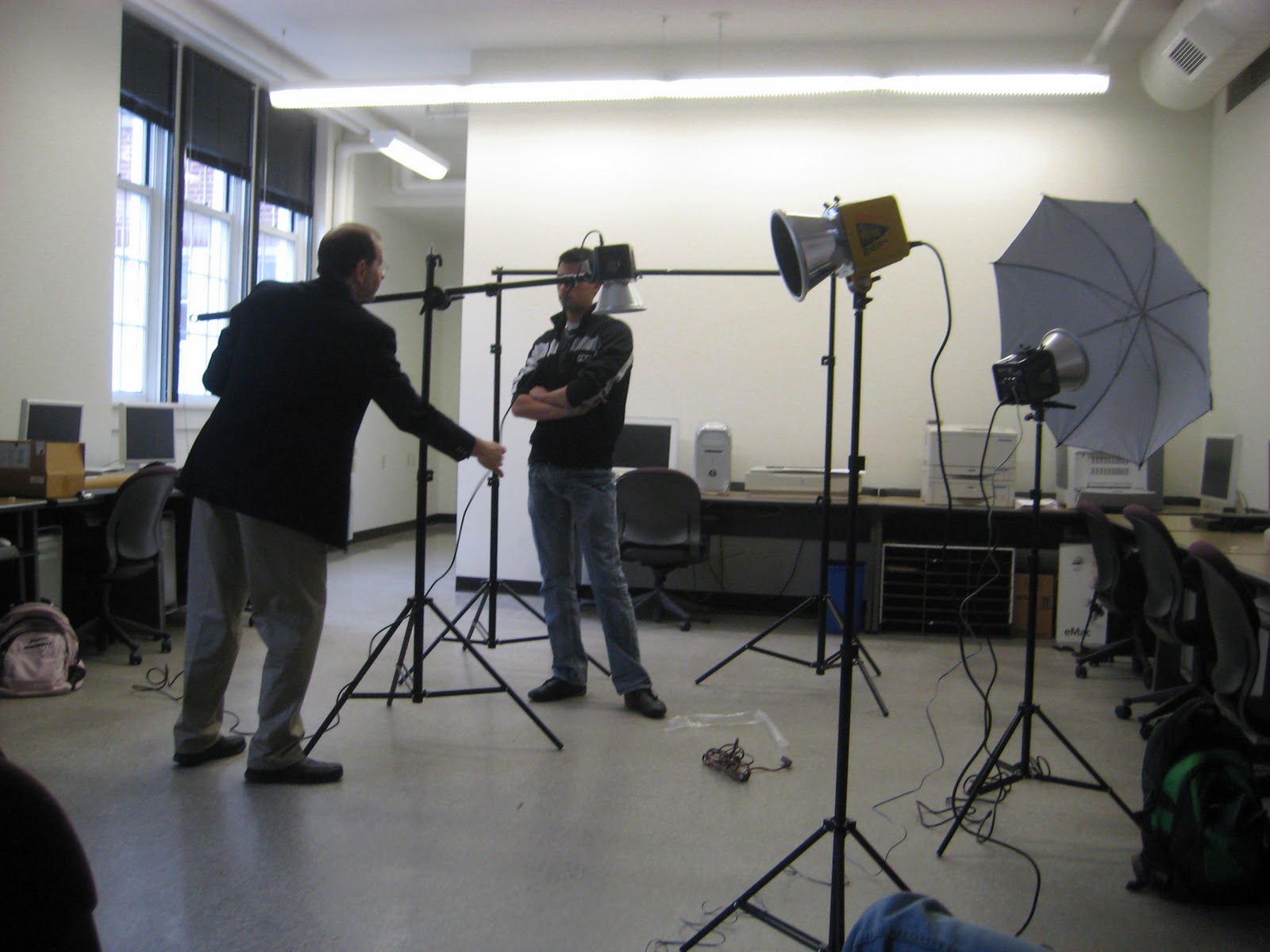
Rusty and Corey taring stuff up

There is such thing as a boom for photography lighting. Rusty was having too much fun

Tee Hee

How many collage professors does it take to screw in a light bulb? (BT Dubs, this light bulb blew up merely seconds after this photo was taken)

Rusty trying to fix his "oops"
Friday, March 4, 2011
Time Sheets
Secrets of Feeling Full
Budget: 6
Time Spent: 5.5 Hours
How Safe:
Budget: 6
Time Spent: 6 Hours
Red Barn
Budget: 5
Time Spent: 7.8 Hours
Herp
Budget: 6
Time Spent: 2.7 Hours
Heritage
Budget: 6
Time Spent: 4.4 Hours (Plus a lot of time on finishing touches that I didnt track time on)
Budget: 6
Time Spent: 5.5 Hours
How Safe:
Budget: 6
Time Spent: 6 Hours
Red Barn
Budget: 5
Time Spent: 7.8 Hours
Herp
Budget: 6
Time Spent: 2.7 Hours
Heritage
Budget: 6
Time Spent: 4.4 Hours (Plus a lot of time on finishing touches that I didnt track time on)
Thursday, March 3, 2011
Midterm Portfolio

The Secret of Feeling full spread is one that I printed out and I think it is one of my favorites. I am partial to the self shot photograph and all of the white and light colors. Its hard to think of what I would go back and change if I could just because it has already had so many changes. I just really enjoy this one. One negative thing I could find is that I cant really picture it being in a real magazine. Not really sure what it is about it but over all, I think the kid done good on this one.

How Safe? How safe huh? Not safe at all is the answer! I nearly lost my marbles over this one! This is ugh I think my 4th or 5th version of this spread. I must admit that it is the most successful version even though it was the least though out. I think that the over all spread has a nice balance and appealing facade, but I think that something more abrupt and alarming would have been more appropriate for this article. Also, I feel a little bad for my unoriginality on this one. Pretty much just jocked this from what I saw was getting approved in the class. Although I don't have a ton invested in this one, I must put aside my pride (like I must do every other day in Vis Vom) and do something that "just worked". I am happy with my choice to print this one off as well, because the colors turned out beautifully (A really feat for the printers in the lab) Thank you Ashley Buhmann!

This Red Barn poster is not the most thrilling thing in the world, but I think it does a pretty good job at serving its purpose. I went in and added more money to the pocket (Rusty's request) and I am glad that I went with the had written tag, rather than the typed one. Ahhh, our vis com II world before color was a sad, sad, little world. Bring on the pantone swatches baby!

Herp. Yuck. Still leaves a bad taste in my mouth. Anyway, I think that the color and photograph in the spread are really successful. I will be the first to admit, I didnt really blow anything off the concept map with this one but alas, it has the little red "ok" in the corner, and Ill take 'er! I Think one of my favorite things about this poster (other than the" ballin" eye ball ) is the way that the tan and yellow box in the bottom right corner mildly mimics the National Geographic Logo (I think it helps the poster look a little more legit). I had thought about adding some melting ice to the upper right corner but after experimenting with it, I saw no point in defacing the beautiful photo. (Bee tee dubs, the word HERP is NOT allowed in the vis vom lab from this point on!)

Dey Ate WHA with their hands?!

They Did WHAT fo fun?!

They Wore WHA on their heads?!
Native American Heritage Month Poster Series. For starters, I know these aren't flawless, but, Rust said he, "would buy that for a dollar" (what ever the hell that means, right?) hehe anyway, I took upon myself that that meant, "Yes, Shelby, all three of those are approved" I got a late start on these but I feel like it was worth it to develop the concept. This poster got pretty personal by the end. By personal, I mean I took over 100 photos of my awkward self lookin' like a fool, as well as hand writing the text and hand crinkling the paper in the text and background. I feel good about the effort I put into this one, worth every second (every second over budget as well) hehe.
Wednesday, March 2, 2011
A-Freaking-Proved


These are the text heavy layouts that we have been working on. Rusty hath brushed over them with his red, fine tooth comb for weeks now and they finally got that miniscule red "ok" in the corner- Yeppie!
(Just because it would be like me to end on a positive note, I would like to point out that that is my 4th "How Safe" spread that I made in a few hours (after slaving over the first three of an amount of time that shall not be mentioned or disclosed on time sheets- Grrrr)
Works in progress
Native American Heritage Month
I Shot new photos for all of these and finally figured out what I wanted to do with the photoshop effects so I'm starting to see a gimps of what I imagined this to be. Im going to have to tinker with the second color, it might be a little light and the text on the left is just that - texts that has been pushed over to the left and kind of forgotten about so I will work with that a little more


There is so much white in the background of this one that you can tell that its a 13 X 19 poster online. This is my attempt to salvage my Jazz Combo Poster idea. Very Very Rough but Im hoping I can work with it some and develop it quickly (yeah, like that ever happens)
Subscribe to:
Comments (Atom)